Saturday, December 3, 2011

Harmony - Top 3 Looks


What is colour harmony?  Well, I think to answer this question, you need to know the definition of harmony itself:

1) Agreement in feeling
2) A pleasing combination of elements in a whole

Thinking of these definitions in relation to colour theory and colour analysis, I had a huge 'a-ha/light-bulb' moment - perhaps my biggest yet!!!
So what was my a-ha moment???
Well, In writing my last post and seeing the 'harmony' created with the copper shadow and Mocha lipstick, I decided to post these photos in my facebook 'true autumn' album that I created.  After posting these pics, I went back and looked at all my True Autumn photos from the begining (starting from the draping process, all the TA looks I've created so far up until now).  There was one thing that really struck me in looking at these photos of myself - I found myself questioning why some looks have that elegant, sophisticated harmony, while others (although they suit me) don't look quite as harmonious???  I think the light-bulb moment came when I realized that although I love my TA fan, not all the colours on the fan are great makeup choices - some are better as clothes and accessory choices, others are better as shoe, scarf and belt choices etc etc etc.  So how do you know what makeup shades to choose to have that 'Harmony', that 'agreement in feeling' that you look healthy, alive, beautifull?  To have that 'pleasing combination of elements in a whole'???  Well, I started thinking about Sci/art and especially Christine Scaman's blog posts on her 12 blueprints website - I always pay attention to when she says that nature doesn't lie and all the colours that look great on you are colours that already exist in you (hair, skin, eyes).  She often uses nature as a guide as well - looking at the beautiful forests and leaves during the fall months to get inspiration for TA's for example.  While shopping at Sephora today and picking up the #54 eyeshadow, I realized that the amber specks in my eyes, harmonized so well with this eyeshadow colour.  The Gingerly blush that I like so well, mimics my natural flush and that Mocha lipstick by MAC really is the colour of my natural lips - and there it was - my 'light-bulb' moment.  Yes, I love oranges and look good in orange, but do I need to buy a bright orange blush and wear it on my face? No!!!  I look great in a chocolate brown jacket, but do I need to wear a deep brown lipstick?  Not unless I want a deep and dramatic look!  I think the point I'm trying to make is that to really get a classic look right and a look that is elegant and personalized - meant JUST for you - you need to look at which colours within your palette mimic your natural colouring.  Perhaps a copper toned TA woman would look better in the brighter copper shades of the palette because these mimic her natural colours vs me that needs a warm brownish base to my colours and shades with gold and amber undertones to mimic the flecks in my eyes.  I know this is becoming one of those long posts, but I think its worthwhile to publish.  You may not be a TA, perhaps you're reading this and you're some kind of winter or spring or summer - but the same concept of Harmony applies to you - look for the colours that already exist within you - if you're a True Summer, look for that natural cool mauve flush in your lip colour and mimic that shade with a similar lipstick colour - don't force a deep purple pink just because its part of your palette, or keep that shade for an evening glam look, but for everyday, find inspiration in what is naturally 'YOURS'!!! 
I know many people are visual learners (including me), so here are my top 3 harmonious looks:


1)  THe makeup I'm wearing compliments my skintone and brings out the best in me.  The gold/amber tones on my eyes compliment the amber scarf which mimic the amber flecks in my eyes, making them 'pop' - this is one of my favourite looks so far:
Face: W4 Concealer by Loreal, HD Foundation in #155, Refined Golden Bronzer (MAC) and MAC's Gold Deposit Face Powder is going on my wish list!!!

Cheeks/Blush Shades: I used Pretty Your World's 'Hot and Spicy' blush and then added 'Goldfish' as a pop of colour (also a Pretty Your World blush shade)
Eyes: I started with Silent Night shadow by NARS as a base. I used MAC's woodwinked from lid to crease and then used Saddle eyeshadow in the crease/outer corners (also a MAC shadow). I lined my eyes with Teddy (upper and lower lashline) and then smudged Romp (MAC) shadow into the upper lash-line. I finished with a basic black mascara from Lancome (although I think I'm going to make the switch to Brown).

Lips: I wanted the lips to be natural and have that really polished, elegant look, so I mixed Sandalwood Beige lipstick by Revlon with MAC's Strength lipstick - I really love this combination for day!


2)  This photo is of my post recent post - this lipstick Mocha by MAC is a perfect TA shade and its actually the closest thing I've 'ever' come to a look that is 'My lips but better'.  Bobbi Brown often says to find a lipstick that is only one or two shades darker than your natural lipcolour and Mocha 'literally' is that colour.  Here is the rest of the makeup I used:
I used Loreal's W4 concealer and foundation, MAC's Gold Deposit powder and Gingerly blush.  On my eyes, I started with NARS silent night, added #54 shadow from the lid into the crease and then lined my eyes with MAC's Teddy eyeliner and blended NARS Bengali shadow into the upper lash-line.  I used Loreals Voluminous Brown-black mascara.  I then finished off the look with MAC's Mocha lipstick


3) I feel that this is my most harmonious evening look.  I used a lot of gold/copper tones on my face, and once again, it picked up on the gold undertone of my skin and the amber flecks in my eyes - the result is eyes that 'pop' and gold tones that literally 'awaken' my skintone.  The lipstick 'Chili' by MAC 'compliments' the gold/copper tones and in turn creates a harmony of colours.  Is this look more dramatic?  Yes, but it is still harmonious with my colouring? Absolutely and thats the key to the puzzle!!! 
For this look I started with my basic face (W4 concealer by Loreal, HD Foundation #155) and then applied Gold Deposit all over my face. I then used FACES #134 blush (a deep russet shade) and decided to compliment the rest of the look with 'golds' on my eyes (I stated with NARS Silent Night as a base, used MAC's Woodwinked from the lid into the crease, Amber Lights on the lid and then blended Romp into the crease/outer corners. I lined my eyes with Teddy liner and then smudged NARS Galapagos into the upper lash liner before finishing with Brown-Black mascara). I decided to give my lips some warmth combined with a wow factor red, so I used by trusted Chili with Auburn lipliner (MAC).


As I mentioned, I know there was a lot of reading with this post, but I felt I really had to explain well my feelings about what harmony means to me in the world of makeup.  Its one thing to be a makeup artist and have a ton of colours to work with, but when it comes to finding a look that works for you and you're on a budget, its good to know that you have 2 or 3 looks that you know will never fail you.  I think every woman should invest in having her colours done, regardless of how old you are.  I don't think having your colours done is an 80's thing - I think its one of the best tools you can have to help you find and discover your best self - to find the shades that bring you to life vs those that make you look sick and grumpy - In the end, its about YOU and what makes you happy.  For me, discovering harmony within my colour palette, has made me very, very happy!!!

The marriage of Mocha and Copper

Today I woke up, tried a natural makeup look and then realized that I needed to get a pair of pants hemmed so I braved the crazy Christmas shoppers and went to the mall.  Of course, there was the usual 'shop for an hour while you wait for your pants to get done' and what stores did I go into?  This is not a trick question - lol - Sephora and MAC of course!!!  I think I have a better understanding of my True Autumn palette, so when I saw Make Up For Ever's #54 eyeshadow it was 'Love' at first sight.  To me the colour looked like a warm ambe-brown, but the colour itself is called 'copper' - its not the usual shimmery copper you'd expect, its actually more of a muted, matte copper, which is what makes it so wonderful!!!

After my wonderful purchase at Sephora, I walked just around the corner to my favourite and trusted MAC Store, where my eye kept on gravitating towards Mocha lipstick - I have talked to fellow True Autumns on one of the facebook group pages I follow called '12 Blueprints' (if you're interested in colour analysis, this is a fantastic forum with wonderful ladies who share ideas, information and makeup looks - Also, the creator of the site Christine Scaman, just wrote a new book called 'Return to Your Natural Colours' - check out her blog post for more details: http://12blueprints.com/return-to-your-natural-colours/ ).  I tried on Mocha in the store and the Make-Up artist there said she's never seen Mocha look so natural and have a 'Your Lips but Better' effect - that was all it took, I walked home with Mocha as well! 


I found that both these shades were perfect for an everyday True Autumn look - the warmth of the eyeshadow in combination with the natural lip-colour is both elegant, soft and classic. In fact, it fits in very well with my Kibbe Soft Classic style.  For the following look, I used Loreal's W4 concealer and foundation, MAC's Gold Deposit powder and Gingerly blush.  On my eyes, I started with NARS silent night, added #54 shadow from the lid into the crease and then lined my eyes with MAC's Teddy eyeliner and blended NARS Bengali shadow into the upper lash-line.  I used Loreals Voluminous Brown-black mascara.  I then finished off the look with MAC's Mocha lipstick:


I think that the marriage of #54 eyeshadow and Mocha lipstick create the perfect True Autumn natural look!!!

Personal Palette from my Colour Draping - Part 2

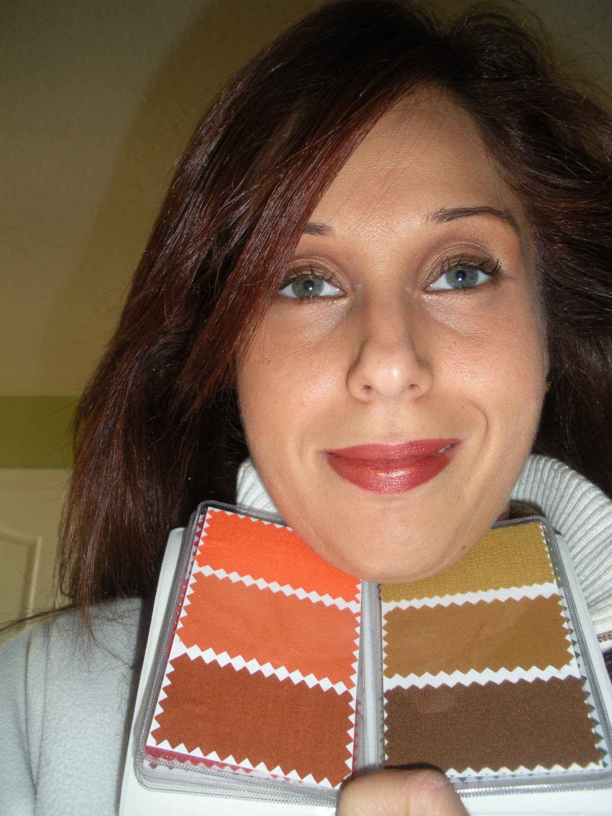
THis is an extension of my last post.  I decided that instead of just posting photos of the colour palettes, I would do a classic everyday True Autumn makeup look and then take a photo with the palette next to my face so you can see how well the colours all harmonize:


THese shades are my best 'neutrals' - Chocolate brown and the ivory/cream shades are particularily flattering as clothes and accessories.


I find these colours of my TA palette to be very flattering against my skintone - these colours are the warm berries, eggplant and brownish reds of my palette.  I think these would make great purse and scarf shades!


My favourite orange-red lipstick 'Chili' matche one of the swatches on the left hand side.  I can see myself wearing the shades on the right hand side during the spring/summer months.  I love that coral and I think it would be a great blush shade for the warmer months as well!!!


These are my favourite colours in the whole True Autumn Palette - I love the golden browns, golden-orange-browns, mustard and warm peach shades.  I look for a lot of clothes in the colours of the right hand side of this palette - they are great as colours for sweaters and tops.  I also have a scarf that is similar to the middle swatch on the right hand side and I wear it all the time!  I feel these colours work very well against my skin-tone!!!


THe greens of my palette - I think these are the shades that I struggled with the most at first.  I'm not really a green type of person, meaning green has never really been one of my favourite colours, but looking at this palette against my skin, I'm really liking how the moss and warm khaki greens work against my skin.  Cool true greens have always made me look fake and un-natural, creating disharmony vs the harmony that I'm seeing here with the moss greens and khaki's.  Its fun to see how all these colours are reacting with my skin and working together with the natural tones in my face, eyes and hair!!!


During my analysis, it was so obvious that the teal, warm blues were such a great fit for me in comparison to the cool toned blues (true and royal blue looked particularily unflattering on me).  However, the teal blue just brought my face to life!  I used to stay away from wearing a lot of blues because I thought my only options were light powder blue, sky blue and royal blues - all the cool toned blues.  I never really liked this shades on me and now I know why - they drain the life right out of me.  These swatches look amazing and I'm so happy to finally have a set of blues I really like. 


Thesear darkest shades in my palette and are not my favourite.  When I was drapped in the Deep Autumn colours just for comparison, the shades were similar to these and they were just too dark and not as becoming and elegant on me as the True Autumn shades.  However, its great to know that I can use these colours as accessories like shoes, boots, purses, belts etc


Here I am holding the sci/art swatch fan for True Autumn - similar to the swatches of my draping and an indication that the True Autumn palette really is the best for me!

Friday, December 2, 2011

Personal Palette from my Colour Draping

Its difficult to descibe the colours I was draped in this past fall, so I decided to take some photos of the palette I was given.  Each of the mini fabric swatches in my personal palette, were the same fabrics used in the actual draping:


I also wanted to include a photo of the sci/art True Autumn swatch fan for comparison:


I don't know if it has anything to do with the way these colour swatches are presented, but I'm finding that the colours I was draped in are just slightly brighter than the sci/art swatches.  If this is the case, then I can totally see how I can be more of a bright autumn:


 - What do you think?  I'd love to hear your opinion!
DO you see me more as a Bright Autumn or True 'Classic' Autumn???

I need a little 'Stength'

I just love it when a lipstick has a cool name - one you can relate you or makes you feel sexy and strong when you wear it!  Who wouldn't want to put on a colour called 'Diva' or 'Vixen' or even 'Femme Fatale' - all these names just give you that extra jolt of felling feminine, alive, mysterious, sensual.  For me, I'm loving 'Strength' by MAC right now - I think I need to feel more strong, confident, assertive, 'the world is my oyster' mixed with a little 'don't mess with me'!  I think our look and how we present ourselves to the world is more important than we think.  Should we become obsessed with how we look?  Absolutely not, but I think how we present ourselves says a lot about how we feel about who we are.  If you dress in torn clothes, wrinkled tops and baggy pants, you're showing the world how little you think about yourself, you're showing the world that in your own eyes, you don't matter!  How about showing the world what you're really worth?  You're worth buying a lipstick with a cool name, you're worth putting on a great dress with heels, you're worth looking fabulous regardless if you're going to the corner store or out to a gala.  You are sooooo 'worth it'!!!  So here is my 'I'm worth it' makeup look, inspired by Strength lipstick of course:


For this look I started with my favourite Loreal True match W4 concealer and foundation.  I then used a powder brush and mixed MAC's Refined Golden Bronzer with MAC's Gold Deposit Mineral Powder.

For my eyes, I started with NARS Silent Night as a base and then used MAC's Woodwinked from the lid into the crease.  I used Teddy eyeliner (also MAC) and smudged Galapagos shadow into the upper lashline and also used this showder on my brows (this is a holy grail shadow for anyone with warm or neutral tones - I love it!)

For my blush, I used MAC's Gingerly blush - its a great everyday neutral blush - still warm, but not too orangey, which is a nice change once in a while - its great when you want to create that neutral, yet pretty look!

Last but not least, the star of the show - I used Revlon's Sienna lipliner and then filled my lips with Strength lipstick by MAC - its a winning combination for me!!!

My advice to all women is to go out there, discover the looks you love - take them out of magazines, find inspiration from nature or travel, whatever speaks to you, then create a look that is really 'you' and shows the world how worthy you really are!!!  God Bless!!!!!!!

Thursday, December 1, 2011

Classy Evening Out

Putting together an outfit can be a lot of fun, especially when you have a good grasp of what style suits you best.  I love pencil skirts, unique tops and blouses and I adore wearing knee-high boots (there is just something so sexy about knee-high boots to me).  My Kibbe style is the 'Soft Classic'.  I'm not 100% sure if this is soft classic or not, it seems to have some dramatic elements, but I could be wrong.  The most important thing is that I feel great and this is exactly what I would wear for a classy evening out.  I've also worn this to school when I have a meeting or need to meet with parents of the students I teach.  I find it professional without being too over the top.  I got this skirt a while back - I think it was from Dynamite and the top is from Melanie Lynn (one of my all time favourite stores).  The boots are from Nine West (this seasons collection).  I would love to hear from you - what is YOUR favouite outfit for when you want to look classy and professional?


Wednesday, November 30, 2011

Gold Deposit Mineralized Powder by MAC

I think that of all the makeup I own, this is quickly becoming one of my favourite products.  I love the fact that this blush has the feel and easy application of a mineralized powder, along with the most fantastic, deeply pigmented colour.  In the pan Gold Deposit looks like a dark bronzed gold mixed with a hint of copper.  On the face, it applies as a beautiful golden glow, more intense and 'golden' than a bronzer, but not overdone or too shiny/sparkly.  I decided to stay consistent with the gold theme and use gold based eyeshadows and a warm cheek and lip shade.


For this look I started with my basic face (W4 concealer by Loreal, HD Foundation #155) and then applied Gold Deposit all over my face.  I then used FACES #134 blush (a deep russet shade) and decided to compliment the rest of the look with 'golds' on my eyes (I stated with NARS Silent Night as a base, used MAC's Woodwinked from the lid into the crease, Amber Lights on the lid and then blended Romp into the crease/outer corners.  I lined my eyes with Teddy liner and then smudged NARS Galapagos into the upper lash liner before finishing with Brown-Black mascara).  I decided to give my lips some warmth combined with a wow factor red, so I used by trusted Chili with Auburn lipliner (MAC).

This is the perfect 'going out' look in my opinion - its warm, golden, but not over the top and its classic yet romantic all at the same time!!!