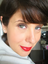
Since my 'Rose vs Peach' posts, it was suggested that I do some more drapes but this time directly against my skin to see how the colours react. I decided to take it a step further and do a whole bunch of different coloured drapes. I'd love to hear your reactions and freedback - Which drapes bring my skintone to life? Which drain me?:
The first drape is a True Autumn shade - I love the colour, but not too sure how it reacts to my skin - I feel it lights up my eyes, but makes my skin look a beigy pink vs adding that warm glow that TA's are supposed to have?
ANother colour that I love, but I can't believe how 'orange' I look - literally, my skintone changed from a pale shade (in the top photo) to an orange shade - nothing else has changed other than the drape (also, its important to note all these photos are taken in natural light, no flash, zero makeup)
This is a Soft Autumn drape - I purchased this top with the SA palette in mind and I have to say that I do really like it against my skin - my skin feels and looks clearer - any blemishes seem to kinda disapear - do you notice this as well - also, my skintone appears more 'even' - its not too pale or too orange, as in the first two photos I posted!
This is a soft blue/lavender shade - not sure how I feel about this - not bad, but not my favourite!
I have to say that I don't particularily like this winter pattern and colour against my skin - the colours completely 'overpower' and thats how I felt when I wore the Cool Winter shades - all you saw was the makeup, it overpowered me!!!
This drape is taken from a jacket I own that is a lighter warm beige shade. I feel this colour is too light for me, but as an accessory shade it works, but putting colour preferences aside, I'm really trying to see how the shade is reacting to my skin and I have to say, its not bad!
This is a salmon/coral shade that I really like - its a softer coral vs a clear, bright coral - I really like this colour against my skin - much better than the cool pinks!
This is a warm pink shade and again, similar to the soft coral salmon, I really like it against my skin!
THis is a terracotta shade that any of the Autumns can wear - Its probably the closest shade that SA's have to orange - If you compare this photo to the pumpkin orange above, its clear that this shade is so much better for me - my skintone isn't turning 'orange' - instead, it looks healthy and clear!
I wanted to post this honey-camel SA shade to compare of the first TA 'warm amber' drape - the amber drape has that draining effect, whereas this SA honey colour is 'warm' but I find it works much better against my skin. I love this jacket and get many compliments when I wear it!
This was the only deep rose drape I could find - I don't mind it against my skin, but find that my skin is starting to turn slightly ashy!
I'd love to hear which drapes are your personal favourites - which colours work the best - my favourite is the soft salmon/coral shade as well as the 3rd drape from the top (the soft, brownish-warm-rose shade). Since I'm personally leaning towards SA, I decided why not combine two posts into one - here are a few SA lipstick drapes - I'd love to hear your opinion:
This is me wearing Incognito lipstick by Chanel with Laura Mercier's Spiced Cider Blush
Freckletone lipstick by MAC with Spiced Cider Blush
Ginger lipstick by Elizabeth Arden with Spiced Cider Blush
I find these shades look natural and really compliment my skintone - my favourite is Incognito (for everyday) and Ginger for a deeper lipstick look!!!
I hope that you all enjoyed this post - its interesting to see how colour can influence your skin - colour theory really is important and can change the way you look and feel!!!
Subscribe to:
Post Comments (Atom)


6 comments:
Have you ever tried MAC Charismatic lipstick? I don't know if it's TA or SA - but it's gorgeous.
I have tried Charismatic and I 'LOVE' it - now I'm really curious - is it a TA or SA shade??? or is it one of those cross over shades???
The incognito lipstick looks like a natural enhancement of your lips rather than a pretty color added to your lips. As far as the fabric drapes ... the only one I didn't care for was the winter pattern. The others were nice -- even the orange. I didn't see the ill effects you were describing. The richer medium tones seem to be the most flattering.
Thanks for posting all these photos of your draping experiments! It feels like taking a little course in colour analysis!
I vote for soft summer. The pinker colours (8 and 11) are better on you than the salmons. Your palette would be a bit warmer than your typical summer, since you can pull of the third colour, but I can't see you as an autumn. Would like to see a soft autumn/ soft summer comparison!
I agree with the third anonymous comment, you seemed to lean towards the soft summer colors.
Post a Comment