Saturday, December 31, 2011

Finding a POWER colour

I love colour - colour inspires me and I love how colour has that mystical ability to change your mood and energy.  Some days I just want to surround myself with a soft warm beige colour, while other days I'm up for a pop of spicy red!  I really admire when people take the time to study what colours look good on them.  I think its particularily important to find that special colour in your palette that makes you feel happy, confident, alluring and poweful.  This colour choice shouldn't be taken lightly - finding a power colour has the ability to change your life - draw people to you, help raise your energy and finally, become a part of 'you', manifesting as your special signature colour.  I've had my True Autumn palette for a while now and It seems that everytime I look at my colour fan, my heart seems to just beat faster when I see my 'teal' shades - I feel magnetic around these shades - I feel 'alive'!!!  I'm confident that the warm teal blues of my palette are my power colours!!!


Since the colour teal is a brighter neutral in comparison to the browns, camels and warm beiges of the Autumn palette. I decided to add some of the teal bright elements to my makeup as well.  I started with my basic face: W5 foundation by Loreal, Bobbi Brown warm beige concealer and MAC Gold Deposit powder all over.  I then used Strength lipstick my MAC as a cream blush and added Pretty your World's 'Buddah' blush on top.  For my eyes, I used NARS silent night as a base, MAC's Soba from lid to crease and Woodwinked in the crease/outer corners.  I then lined my eyes with MAC's Indigo eyeliner (a stunning teal shade) and blended woodwinked into the upper lashline.  I finished with a brown-black mascara by Loreal Voluminous and a swipe of Sandalwood Beige by Revlon!

I find that teal makes me feel brighter and happier inside, which is why I decided to choose it as my power colour.  It makes me feel very feminine and I love that I can wear almost any other colour in my palette along with the teal - it looks fantastic when combined with the browns, camels, peaches and even the terracotta orange shades as pops of colour!  Teal is definitely a winning colour in my eyes!!!

Thursday, December 29, 2011

Finding Harmony in Landscapes

One of the best ways of seeing if your colouring really works within a particular season is to see your features against a lanscape of that season.  I was inspired by my many facebook friends that have been creating various photos of themselves against their seasons landscape.  One Deep Winter women attached a photo of herself in a dark winter landscape - the result was this striking harmony - her features, colouring, skin, eyes etc - they all harmonized with the landscape.  Another woman who is a cool winter, looked so striking and powerful against a cool winter lanscape.  The result was not overt coolness, but a crisp, striking beauty - it was amazing to see her beauty come across with her seasons landscape in the background.  I'm not very tech savy, so a good FB friend put these together for me - they are various photos of me against my seasons lanscape - Its so amazing for me to see the harmony that is evident is each one of these photos, but the absolute best are the True Autumn landscapes that are rich and warm!


Of all the Autumn lanscape photos, I think this one is my all time favourite - every single colour within this lanscape harmonizes with my colouring - even my eyes seem to somehow be reflected in the water.   I feel very relaxed looking at myself in this landscape - it feels like 'home'!


I feel like my skin is reflected in the lightest shades of the warm rusty-sky.  I absolutely adore the warm browns in this photo in combination with the warm peaches and rust shades.  I also feel very 'at home' in this photo an I think I'm going to use this photo to help guide my makeup choices - I love the warm, earthy elements!!!


I recall trying to a very soft, true autumn makeup look for this photo and although I think I look good in this photo, I wish I had gone even warmer, perhaps using more amber and rust shades - I still see harmony, but not as much as when I wear the spicy, warm shades.  My makeup seems more 'soft' vs true autumn and its making me look too pink.  The top I'm wearing is awesome, but I'm really going to have to stick to the true warm and rustic makeup shades of my true autumn palette!


When I look at this photo I feel gentle and calm - my makeup is still soft, but its 'warmer' and I feel it harmonizes better with the warm colours of these flowers.  I think that if there were added brown, gold and rust tones in this photo, it would harmonize even better!  I'm really drawm to the warm yellow and rust shades in this landscape - I find the peachy/tangerine flowers a little too spring like for my complexion - I need the muted, spicy warm shades!


Last but not least, here is a bright autumn landscape - again, the harmony is amazing here - I feel really at home and like these are 'my' colours.  I feel my makeup helps me really be a part of this landscape.  After looking at my makeup and seeing how the various colours react to the various landscapes, I'm seeing that the warm, spicy 'Chili' red is really by best red, along with the earthy-brown lipstick 'Photo' (both by MAC) - they seem to harmonize the best and bring me to life within the landscapes!!!

Being able to see myself against these landscapes and seeing how well the warm earth tones harmonize with my skin and palette, really makes the True Autumn colours 'real' for me - I feel like I really belong, even more than ever and I feel a gentless and calmness when I see how well the warmth harmonizes with my colouring!!!

If you're not sure what your season is, try putting adding a photo of yourself to the different landscapes of the seasons, perhaps you will feel really at home in one of them and it will help you in determining your best season.  Getting draped is really the way to go, but if you can't - try this experiement and see where you feel you 'fit' - you may be amazed!!!!

Sunday, December 25, 2011

My Top 5 favourite Christmas Movies

One of the things that I love about Christmas are the hillarious movies that I get to watch with my family - we laugh so hard, we cry!  Christmas really is about being with family, celebrating the birth of the Christ child, enjoying the Christmas spirit that is in the air, eating amazing food and treats and sitting down to watch a classic Christmas movie.  THroughout the years, these five movies have remained my all time top favourites:

1)


Christmas with the Kranks is one of the funniest Christmas movies in existance in my opinion.  I love watching this movie with my dad because we laugh so hard that we cry.  Tim Allen is his usual, hilarious self and the anticts that go on are just too funny!  This is one of those movies that I would watch even though it isn't Christmas, but I try to reserve it for Christmas time, since its becoming a Christmas Tradition for us to watch this movie together!


I think that this movie makes it on almost everyone's Christmas movie list - its one of my all time favourites - Chevy Chase is just a master comedian in my opinion and no matter how many times I see this movie, I seem to love it more and more.  The scene where he puts the cooking spray on the round metal sled is still my favourite!


Irving Berlin's 1954 Christmas Classic 'White Christmas' is a very special movie for me!  My grandmother and I used to watch this movie together every year and I have the fondest memories of her when I watch this film now.  I always think the era in which this film was made and life was not easier, but it was simpler and love just seemed less complicated - I'm also a sucker for the hair and makeup of that era!!!


Elf is a movie that makes me laugh from start to finish - I love the whole concept of a human elf visiting New York and discovering it for the first time.   There are too many favourite scenes for me to write about because every one of them are just so funny.  This is definitely a Christmas favourite!


Four Christmases is a great CHristmas movie - I can't say its on the same level as 'Christmas with the Kranks' or 'National Lampoons Christmas vacation', as I consider these classics, but I think this movie is hilarious.  I also like the message of the movie at the end - I think we go though each day of our lives getting lost in our own lives that we forget sometimes that its not just about 'us' - spending time with your family is sometimes a way to help you stay grounded and especially at Christmas. to remember that its not about 'me, me, me' all the time, but its about others and being empathetic to others needs and struggles.  I have to say that the nativity scene in the church is simply hillarious - Vince Vaughn is just so funny in that scene!

Well, these are my top 5 favourite movies!  I'd love to hear from you and find out what some of your favourites are???

MERRY CHRISTMAS!!!!!!!!!!!!!!!

Saturday, December 17, 2011

NARS Joyous Red Lipstick

NARS Joyous Red is part of the new Holiday Collection.  Its a limited edition colour and its perfect for an everyday 'tis the season look.  Although its described as a 'red', it seems more like a 'deeper neutral' shade.  Compared to a classic true red, its much more muted, warm and and orange-peach based.  I haven't decided I want to go back to Sephora and pick one up - I just tried it on and then snapped a few photo so I could do a little review and show you the colour:


For this makeup look I started with Loreal True Match Foundation in W5.  I then used Bobbi Brown's concealer in Warm Beige and applied MAC's Gold Deposit as a powder.  I used Strength lipstick by MAC on my cheeks as a cream blush and then applied Laura Mercier's Spiced Cider and Pretty Your World's 'Orgasmic' blush as a pop of colour.  For my eyes, I started with NARS Silent Night, used MAC's Soba on my lid into the crease and then applied Teddy and smudged the upper lash line with NARS Bengali eyeshadow.  I finished the look with NARS Joyous Red Lipstick!!!

If you're looking for a nice holiday lipstick that doesn't scream red and is one level above a neutral lip, I think this lipstick would be ideal for you.  The only thing that I dislike about this lipstick is that its a 'limited edition' colour!  I hesitate to buy limited additions because I'm always afraid that I'm going to fall in love with that colour and then not be able to buy it again!!! 

Sunday, December 11, 2011

The Flawless, Timeless, Polished Look

I've been inspired to create that timeless and elegant look for everyday.  Knowing my best colours has been such a helpful part of being able to create this look.  Part of it is still about de-cluttering that makeup bag of mine, but another part of it is to 'honour' the makeup that I do have and work on creating a more personalized look.  Women like Sophia Lauren, Gwenyth Paltrow, Grace Kelly, Audrey Hepburn all have that timeless appeal to their look - they have a 'signature' look.  They weren't changing their haircolour every second week and aparently Sophia Lauren had one signature lipstick shade that she loved so much, that she bought as many tubes as she could when she found out it was being discontinued.  I have this strange love affair with makeup - I love colour, discovering new shades, playing around with different textures, but on the other hand, I want so badly to find that polished, elegant look that is representative of me and that I can 'own' for the rest of my life.  The makeup lines today that do the best and are popular amoungst many women (like Bobbi Brown, Laura Mercier etc) are the ones that speak to a particular look and its one that is simple, elegant and pretty.  I don't think its any coincidence that Kate Middleton went for a Bobbi Brown look for her wedding day - its so polished, simple and timeless - perfect for a princess.  MAC is a fantastic makeup company and some of my favourite products are from MAC, but sometimes I get turned off by all the 'trendy' looks that they try to sell and market.  I don't know why, but I often associate Bobbi Brown and Laura Mercier with a chic, wealthy, elegant woman.  I think Gwenyth Paltrow, Kate Middleton, Rachel Weisz etc instintively know how to capture an effortless beauty look.  I think I've made it a mission for myself to find this 'effortless beauty' look for myself!


For this look, I tried to capture the essence of Laura Mercier's Flawless Face - I started with a sheer foundation, used the Secret Camoflauge #4 wherever needed and the used Bobbi Brown's warm beige concealer before finishing off with a light dusting of Bronzing Powder (I used MAC's Refined Golden).
For my eyes I started with NARS Silent Night as a base and then used MAC's Woodwinked from lid into crease.  I used Laura Mercier's Brown-Copper eyeliner on the top and bottom lashlines and then used NARS Bengali shadow to smudge into the upper lashline.
I used Laura Mercier's Spiced Cider blush to create a warm and subtle glow and then finished the look by mixing my two favourite lipsticks: Mocha by MAC and Cinnamon by Laura Mercier.  Today I was playing around with the Bronzelle lipliner (Lancome) and Cinnamon lipstick look and I loved the subtle effect!


Saturday, December 10, 2011

Laura Mercier Spiced Cider and Cinnamon

Laura Mercier cosmetic products are top quality.  Her blushes feel like silk against your face and the lipsticks glide on smooth and leave you lips feeling moisturized.  I'm really starting to notice that although its more expensive (i.e. paying $30 dollars for a blush vs $7 at the drugstore), the way the products look against your skin and the way they make you feel is really 'worth it'!  Recently, a FB friend on the 12 blueprints company page that I follow (I'm a huge fan!) recommended that I try Laura Mercier's 'Spiced Cider' blush.  I did some internet/google research before I went to Sephora and couldn't help but notice that Cinnamon lipstick is a lipstick 'match' to the Spiced Cider blush.  I was lucky enough to be able to exchange some products that I purchased in the past and never really used and swaped them for the products I wanted.  I walked out Sephora with a few Laura Mercier products.  I got the #4 Secret Camouflage, Black-Copper eyeliner, Spiced Cider Blush and Cinnamon lipstick.  I had already done my eye-makeup that morning and didn't want to muck it up, so when I got home I just applied the blush and lipstick and of course checked to see if it matched my colour swatch and it absolutely did.  I want to thank my FB friend (she knows who she is :) and I always appreciate her advice) for making this recommendation because I absolutely LOVE this lipstick/blush combo:


This is Laura Mercier's Cinnamon lipstick - a perfect blend with the TA colour fan - I was really excited to see how well this colour harmonizes with my skin-tone and its very different from all the other TA lipsticks I own which are more peachy, coppery and orangy.  This colour is more of a warm peachy-rose shade (if that makes any sense) and I noticed that it looks AMAZING against my brown and warm beige toned tops.  The spiced cider blush is a perfect match to this lipstick and fits in perfectly with these colour swatches.


For this look I started with Bobbi Brown Warm Beige concealer and W4 foundation by Loreal.  I used NARS Silent night as an eyeshadow base and then applied Make Up For Ever #54-Copper eyeshadow from lid to crease.  I used Teddy eyeliner on the top and bottom lashline (MAC) and then smudged NARS Galapagos into the upper lashline and also used this shade to define my brows.  I then applied Laura Mercier's Spiced Cider blush and Cinnamon lipstick.  I think that this is going to become a staple TA look for me.  The whole look seems so balanced and the shades all harmonize!!!

Wednesday, December 7, 2011

Aristocractic Elegance

People will always be inspired by that which is aesthetically pleasing, beautiful, pretty etc.  Women in particular are inspired by that natural beauty, allure and mystique that the French know as 'je ne sais quoi'.  What is 'je ne sais quois' exactly?  Well, the dictory describes it as an: "intangible quality that makes something distinctive or attractive".  I often wonder by the rich and aristocractic have this allure?  AND, How do French women know how to channel it so well?  We live in a society that is overwhelmed by trends, whats 'in' and what 'sells'.  I think that many people in seeking the ultimate beauty, over-do it.  Plastic Survery, botox, hair extentions and everything else that is 'fake' has overtaken our vision of what is beautiful.  To prove my point, what emotions come to mind when you this woman:


I see simplicity, natural beauty, colours that harmonize, a sensual yet innocent appeal.   I think that the artist who captured this woman knew about colour harmony and wanted to express that natural flush and beauty that this woman has 'naturally'.  Reading about style, particularily of women who are aristocratic, there is a common theme of a look that is elegant, sophisticated and attractive.  I don't know if you've ever noticed this or not, but aristocratic and very well put together women always seem to have that natural and elegant makeup look.  The colours they wear harmonize and suit them, the application is feminine and alluring, the over-all effect is 'natural elegance'.  French women know how to channel this same elegance.  They know that the most attractive look is natural, sensual with the slightest hint of tomboyish appeal.  Their makeup is never over-done, only perhaps a little more defined and smokey for evening.  Here are some of my favourite looks that have that aristocratic, french, je ne sais quois effect:


I love the classic softness that this woman possesses - her makeup is elegant, her accessories are simple yet classic and her hair is pulled back and well-groomed.  This woman is attractive, timeless, sensual and classic.  I am really inspired by her look and makeup in this photo!


Carla Bruni-Sarkozy really knows how to channel that European allure.  If you've ever noticed her 'look', her clothes are always elegant, simple and chic.  Her makeup is always elegant, minimal and pretty.  She always seems to have that alluring harmony about her and she knows how to carry herself.  Beauty essentially is not always about your exterior beauty, but how you carry yourself and present yourself to the outside world.  If you walk with an alluring confidence, you will present that aura to others.  Its important not just to have your makeup work for you, but to walk strait and with good posture, have a well groomed hair-cut and know you are worthy!


Laura Smet is a French Actress that also seems to possess that alluring appeal.  Once again, she has a certain softness and poise about her.  Her makeup is not about false eyelashes, bright pink blush or tangerine lips - her look is soft, harmonious with her colouring and elegant.  I think that if more young women went for this type of look, there would be a return to 'elegance'.  I often think the same should ring true for young men - its always so nice to see a young man put on a suit or channel that sophisticated suave look!


When Nicole Kidman was part of the Chanel No.5 ads and commercials, I loved her look - she seems so alluring and natural - her nair isn't stick straight and overly processed blonde.  Instead, she returned to her more natural strawberry-blonde, curly mane.  Her makeup suits her spring colouring so well - the light peaches just blend into her skintone, harmonizing and creating that pure and pleasant 'peaches and cream' complexion.  There really is something to be said about a woman who knows herself and her colours, she really shines and has that effortless beauty appeal.


I recall reading in an article once that a real aristocratic woman doesn't flash her money or possessions.  Instead, she looks naturally graceful and composed.  As soon as I saw this photo, I thought of that natural composition.  This woman looks classic and timeless - her hair is long and flowing, her makeup is clean and fresh and again, the colours she is wearing seem to harmonize so well.  She looks healthy and happy - the true mark of someone who is wealthy, regardless of how much money is in the bank account!


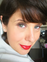
When talking about alluring elegance, I thought it was important to include an 'evening/glam' photo.  What is an alluring evening look?  Its much more dramatic, but not less classy or simple.  Here you see that added pizzaz with accessories, a little glitz, a classic red lipstick, a elegant up-do, a subtle smokiness to the eyes.  However, what you don't see is something over-done.  There is still a poise, mystery, allure - something left to the imagination!!!


One of my all time favourite french actresses is Isabelle Adjani.  She personifies elegant beauty to me.  Her look is striking, elegant and very feminine and sensual.  Her look in this photo is captivating.  She has that cool and crisp colouring, very inspirational to a 'winter' colour type, yet her presence can handle the defined eyes and feminine pinkish lips and cheeks.  I think that if an artist painted her today and captured her beauty, the effect would be regal and captivating!!!

Its inpiring to know that in a world of trends and fakeness, there are still women who know and want to channel that elegant allure.  There is truth to the saying "simplicity is elegance".  Chanel knew this concept and made it part of her entire empire.  She went for that natural appeal vs the over-done flashy fashion that was 'in' then.  I think that we are currently in the same situation - are we going to join the botox injecting, trendy, fake world of fashion?  Or are we going to be guided by simple elegance, finding colours that are harmonious and natural, leaving the imprint of sophistication and grace??? 


Tuesday, December 6, 2011

The 'softer' side of True Autumn - Part 2

I thought it would be fun to compare this softer True Autumn look with the Soft Summer look to see the difference.

Here I am with Soft Summer makeup (The one thing that I 'always' notice about the Soft Summer shades is how much the grey eyeshadows dull my eyes - In the first photo I notice that the pink of the blush really stands out vs blending into my skintone - the makeup seems too 'obvious'.  In the second photo I'm wearing 'earthline' eyeliner, which is recommended for Soft Summers and the effect is complete 'dullness'):


Here I am trying the Soft Autumn shades (these are much better than the Soft Summer shades and some of these are probably cross over shades into the TA palette, but there still seems to be that 'golden' element that is missing):


And finally, here is the softer side of True Autumn:


I think that these photos really show how the warmth and golden tones of the TA palette are a key component to adding that healthy glow to my skintone.  Harmony is definitely present here - the look seemes complete, natural and soft.  With the soft palettes, there is a dullness and something is missing - when I look at the golden element in these TA photos, I see that warmth truely is essential for me!!!

The 'softer' side of True Autumn

I've been thinking a lot lately about how our personal style corresponds to makeup.  Being a 'soft classic' style type, I started thinking about how to use my palette to create the ultimate 'soft' look using the more natural shades of my palette.  I have to admit that when I finished creating this look I felt like these colours were not the warm, golden shades that TA is usually represented as being, but ALL the shades used matched my TA colour swatch/fan.  I used golds, muted coppers, ginger and natural brownish-peach shades.  Perhaps I'm confusing the 'soft' look with the soft palettes, which I feel wash me out.  I feel better knowing that there is a softness to the True Autumn palette - it doesn't have to be all orange, all the time - there is flexibility and originality in each season.  I can still go for a soft look without being a soft season - I find that reasurring, liberating and interesting all at the same time.  Here is my 'softer' True Autumn look:


For this look I started with Loreals True Match W4 concealer and foundation.  I then applied MAC's Gold Deposit powder all over and used Gingerly Blush on my cheeks.  I wanted to go with a softer, less defined eye so I used my staples, Silent night as a base (NARS) with Make Up For Ever #54 shadow (lid to crease) and MAC's Woodwinked on the lid.  I then used MAC's Powersurge eyeliner on my upper lashline and blended in Saddle eyeshadow to create a golden, copper smokey but soft look.  I then used Teddy eyeliner on the lower lash-line for some definition.  I finished off the look by using Lancome's Bronzelle lipliner and MAC's Mocha lipstick.

I tried to take this photo in as natural light as possible and no flash was used.  To me, this seems like the perfect soft and natural everyday or relaxing weekend look! 

Find YOUR Kibbe Style Type!!!

Some people have asked me how they can find their style type and where can they take the style quiz.  This post is dedicated to answering that request.

I want to first start out by saying that I think style is very personal.  I think that you can take a million style tests, but in the end they should act as a 'guide' not as something set in stone. Some people are just naturally drawn to a particular style and they recognize it right away in stores or in magazines.  Other people can spend years looking and perfecting their 'style'. Also, some people suit their style really well, while I think other people try to force a style and in the end, it doesn't really work for them.  My personal advice, is to take some time to get to know yourself - what do you like?  what inspired you?  what is your personality like?  what type of home decor are you attracted to? etc etc.  Knowing your 'self' will help you get a head start because it means your starting your quest being open-minded about who you are and what you want out of life!

Also, please keep in mind that David Kibbe wrote his book .Metamorphisis in the 1980's, so some of the questions and information you read may seem 'dated', but the style types can still be applied today.  The one thing I found difficult soon after learning my style type was what modern day celebrities can I find as inspiration?  I found that instead of looking for a person to look up, it was easier to find a look that inspired me.  For example, being a soft classic, I've always been drawn to stores that have that soft, preppy, classic edge - Banana Republic, Tommy Hilfiger, J Crew etc.

For the main on-line Kibbe source, it is best to check out this website:
http://seasonalcolor.yuku.com/forums/71/Wardrobe-and-Style

Once you get onto the website, look for the DAVID KIBBE'S METAMORPHOSIS EXAMPLE TEST  Here is a direct link to the test: http://seasonalcolor.yuku.com/topic/37/DAVID-KIBBE-S-METAMORPHOSIS-EXAMPLE-TEST
It is important to be very honest when taking this test - some people have found that they have better luck letting their best friend, husband, mother etc take the test for them - being objective is very important because Kibbe is not just about finding a look you like, its about accepting a look that suits your body type and facial structure (i.e. you may 'want' be a gamine, but it may not suit your body type and facial structure, so in the end you need to be honest with yourself if you want to find your best look.)  Think of a petite women with soft facial features - she won't exactly glow as a dramatic type and similarily, a woman with a tall, dramatic body frame and facial features will look quite silly wearing frills and bows that belong to the romantic style type.  Also, if you get dominant D's and E's, especially as a combination (as I did) you may want to look to either Theatrical Romantic or Soft Classic as a dominant type.  Remember, there is more to learning about your type than just taking a test - the test is not 100% accurate for all people all the time, but its a great tool to help steer you in the right direction.

Another way that people have success finding their type is to look at the celebrity collages.  Some people notice right away which collage they fall into or feel more a-like - other people find it helps to use photoshop and add a photo of themselves (a head shot) into the collage.  I find that if you 'blend' into the collage and other people have a hard time finding your photo in the collage, you've found your best fit - if you stick out like a sore thumb, you probably don't harmonize well with that style type.  Here is a link to the celebrity collages: http://seasonalcolor.yuku.com/topic/214/Kibbe-Celebrity-Collages

Once you find that you feel really at home with a particular style, its time to start using the other links on the yuku website to read as much as you can about the style types.  You will find that knowing your style type is more than just what clothes you should wear - its really a helpful compass to show you your ultimate best self - what type of makeup application suits your type, what type of hairstyle fits in with your style, finding accessories that compliment you vs overpower you etc etc - its really about finding a personalized 'look' and most importantly a harmonious look!  Its similar to finding your best colours, your best colours harmonize with the colouring that nature gave you.  Once you know your style and learn about what your style can do - the combinations of looks you can come up with are inspiring and original and most important, they will 'harmonize' with every aspect of who you are - you will shine, not your clothes.  Its like that saying "she will wear the dress, the dress won't wear her"!!!

Wishing you all the best of luck finding your style types - I'd love to hear back from you and learn from your personal experiences!


Monday, December 5, 2011

How to find your BEST red lipstick?

The holiday season is in full gear and this is the time that most women like to sport a red lip.  I don't know if it has to do with red being a colour associated with Christmas or just that red is a classic party shade - its probably both!  You've probably read in numerous magazines that women with cool tones should go with a blue toned red, women with warm tones should go with a more orange/yellow red, while women with neutral skin-tones should go with a true red.  Do I agree with this advice?  Yes, to a certain degree!  The more I learn about style - the more I realize that red has more to do with the look you're trying to achieve and then using that inspiration to find harmony so that your 'look' is balanced with a colour that suits your skintone, colourtype and personality!  Its not as complimated as it sounds.  Here are a few examples:


The 'experts' are interesting to me because on one hand, they say 'if you're going for a red lip, go very natural on your eyes' and their next sentence is 'there are no rules with makeup' - so which is it?  Catherine Zeta Jones is a stunning Winter woman (some say True Winter, others say Deep Winter).  I personally think she is more of a Deep winter because she really suits reds with a brownish base.  Her style is a mix of glamourous and classic.  She is not overly dramatic, overly 'look at me', she has more of a subtle drama about her.  Would a true red glossy lip suit her colour wise?  Of Course, but does it suit her style wise?  Not as much in my opinion!  So even though the experts would say, as a neutral skintone, true red is her best, I think she looks the most harmonious and elegant in this deeper red with a hint of brown undertone.  However, if she decided to change up her look, go for something more black leather, 'come hither', femme fatale inspired - then she would steal the show with a true red lip.  But this post is about finding your 'best' red - one that suits YOU - your style, your personality, your colouring!


If you're going for that uber Jackie O Dramatic-Classic look, this is where a woman can really rock a true red, especially if she is a cool or neutral season.  So why does true red work here so well?  Is it the colour itself?  I don't think so - its how the red works in harmony with everything else - style, personality, colouring.  Have you ever met a a woman, perhaps with Soft colouring and a dominant natural style - can you see her sporting this look?  She would probably be the first person to tell you - I can't do red, red looks too 'hooker-ish' for me.  The interesting thing is, she is right - on her, this look would be hooker-ish because its not in harmony with who she is as a woman.  I find that soft seaons look beautiful in a softer, more pinky-brown based red.  Perhaps its not the dramatic red we know, but SHE is not that woman, so why is the makeup industry forcing her to be???


A woman with a more natural, softer air and mystery about her looks a million times more elegant in a softer red or even a pinky-red gloss.  She doesn't look forced or uncomfortable in the makeup and lipcolour she's wearing, yet she looks just a stunning because she's wearing a red that is in harmony with who she is! 


The women of the Clear colour palette, amazingly enough needs a clarity to her red lipstick.  The clarity looks elegant.  Look at Liv Tyler in the photo above, her striking clear blue eyes, her striking clear aqua gown and her striking clear red lips - her look is 'striking', her colouring is striking, her personality is 'striking' so with this look, she is in full harmony.  If you put this same look on a soft and muted women who has a natural style and personality, well I'm going to stop there actually, because you would never even do that in the first place - its just not who that woman is!

Before I became familiar with my style, colour harmony and personality type, I thought that this was the best and most elegant red for me:


I was going to a very glam event and my knowledge of makeup application made this look believable, but what do you notice first?  The makeup!


Learning that my style type is 'Soft' Classic, that my colouring is a warm-golden True Autumn, that my personality is more about being elegant and classic vs dramatic and over the top, I now see just how harmonious this look is for me.  What do you notice first?  I see my eyes, my glowing skin, how naturally elegant that 'Chili' lipstick looks against my skin.  I don't see makeup first and formost - I see 'Me'!  This is how you know you've found your best red - it works in harmony with who YOU are!!!

Here is a side by side view - the right look should be clear to your eyes right away:


So what kind of women are you???  Whats your style???  Whats your personality??? Whats your colouring???  Are you dramatic and clear?  Are you soft and sensual?  Are you classic and soft?  Or Classic and dramatic?  Who are YOU???  Go out and find that woman you are meant to become!!!


Sunday, December 4, 2011

Warm Vs Cool Toned Blue

Learning about the difference between warm and cool colours is fascinating, particularily when it comes to the colour blue.  I remember during my draping experience being a little bit disappointed about my blue palette because I didn't see any blues that I recognized.  Instead of the typical royal blue, sky blue, light blue etc, I saw shades of teal, warm aqua and deep periwinkle.  I was little off-set about this, but when I started shopping and keeping my eyes open for the right TA blues, I was happy to discover that teal shades are very popular in the retail world.  I was able to pick up two different tones of warm teal sweaters in one shopping day!!!  After playing around with the teals and periwinkles, I have to say that yes, these shades suit me so much better than the cool royal blues.  I decided to do a little picture comparison:


Here I am wearing a cool toned royal blue - the colour is clear and crisp and doesn't look bad, but is it my best???  Take a look at how my skin-tone automatically changes and comes alive in the warm blue (nothing has changed - same lighting, same makeup, same everything except that I changed the royal blue drape to a warm teal drape):


Did you notice how my eyes went from dull to vibrant - how my skin went from ashy pale to warm and peachy???  Its amazing how colour can impact the way your skin looks and how it appears.  The warm blue actually makes my face appear more slender and youthful!  Its just so amazing to me.

Here is a side by side view:


Now the question is what blue do you suit???  Are you a cool or warm toned gal???  Here are some colour inspirations to help you out:

If you're cool, look for these types of blues to add to your palette:


Cool tones women should look for inspiration from the sky, winter landscapes and the blue-gray shades of a dusky sky (especially if you're a soft summer).


Light and soft summers would look fantastic in the light powdery blues, while deep winters would really look spectacular is the deepest and darkest blue shades.  Cool and clear winters glow in the more clear and cool royal blue shades.


Cool toned women have a lot of choices when it comes to blue dresses and there is something very refreshing about a blue dress or top - its chic, modern and stylish!!!

What about us warm toned gals??, well, we rock our blues as well:


Our blues have added warmth to them, particularily added warm yellow shades, which is why sometimes our blues almost seem to have a greenish cast - when you mix blue and yellow what do you get???  However, look how awesome teal is as a dress colour and I think it works ever better as a skirt shade (check out how awesome the picture to the right is - you can harmonize so many wonderful warm shades with that warm teal skirt!)


The warm turqouise/teal shade on the right hand side of this palette would work so well with both a spring and autumn.  It would work much better on an autumn if it were slightly more muted and look uber awesome on a spring with a hint more clarity, but this is a perfect example of a warm shade of turqouise-blue!


The great thing about warm shades of blue is that you can look for lighter and deeper shades of teal.  Here is the perfect medium shade of teal.  Take this shade a level or two lighter and darker and it would still fit into the warm palette, but all of a sudden you've given yourself colour options and degrees of tones to work with.  Also, add some clarity and once again, you have the perfect warm robins egg blue for springs and muted it up a bit and you have autumn calling - its all good in the world of 'warmth'.

So, do warm toned gals have to say good-bye to blues???  Absolutely not - our blue may be different, but its still just as stunning and becoming!  I would rather see my face look youthful and glowing in  warm teal blue than sick and dead in a cool toned blue.  Find YOUR best blue and work with your natural colouring!!!