
What is colour harmony? Well, I think to answer this question, you need to know the definition of harmony itself:
1) Agreement in feeling
2) A pleasing combination of elements in a whole
Thinking of these definitions in relation to colour theory and colour analysis, I had a huge 'a-ha/light-bulb' moment - perhaps my biggest yet!!!
So what was my a-ha moment???
Well, In writing my last post and seeing the 'harmony' created with the copper shadow and Mocha lipstick, I decided to post these photos in my facebook 'true autumn' album that I created. After posting these pics, I went back and looked at all my True Autumn photos from the begining (starting from the draping process, all the TA looks I've created so far up until now). There was one thing that really struck me in looking at these photos of myself - I found myself questioning why some looks have that elegant, sophisticated harmony, while others (although they suit me) don't look quite as harmonious??? I think the light-bulb moment came when I realized that although I love my TA fan, not all the colours on the fan are great makeup choices - some are better as clothes and accessory choices, others are better as shoe, scarf and belt choices etc etc etc. So how do you know what makeup shades to choose to have that 'Harmony', that 'agreement in feeling' that you look healthy, alive, beautifull? To have that 'pleasing combination of elements in a whole'??? Well, I started thinking about Sci/art and especially Christine Scaman's blog posts on her 12 blueprints website - I always pay attention to when she says that nature doesn't lie and all the colours that look great on you are colours that already exist in you (hair, skin, eyes). She often uses nature as a guide as well - looking at the beautiful forests and leaves during the fall months to get inspiration for TA's for example. While shopping at Sephora today and picking up the #54 eyeshadow, I realized that the amber specks in my eyes, harmonized so well with this eyeshadow colour. The Gingerly blush that I like so well, mimics my natural flush and that Mocha lipstick by MAC really is the colour of my natural lips - and there it was - my 'light-bulb' moment. Yes, I love oranges and look good in orange, but do I need to buy a bright orange blush and wear it on my face? No!!! I look great in a chocolate brown jacket, but do I need to wear a deep brown lipstick? Not unless I want a deep and dramatic look! I think the point I'm trying to make is that to really get a classic look right and a look that is elegant and personalized - meant JUST for you - you need to look at which colours within your palette mimic your natural colouring. Perhaps a copper toned TA woman would look better in the brighter copper shades of the palette because these mimic her natural colours vs me that needs a warm brownish base to my colours and shades with gold and amber undertones to mimic the flecks in my eyes. I know this is becoming one of those long posts, but I think its worthwhile to publish. You may not be a TA, perhaps you're reading this and you're some kind of winter or spring or summer - but the same concept of Harmony applies to you - look for the colours that already exist within you - if you're a True Summer, look for that natural cool mauve flush in your lip colour and mimic that shade with a similar lipstick colour - don't force a deep purple pink just because its part of your palette, or keep that shade for an evening glam look, but for everyday, find inspiration in what is naturally 'YOURS'!!!
I know many people are visual learners (including me), so here are my top 3 harmonious looks:

1) THe makeup I'm wearing compliments my skintone and brings out the best in me. The gold/amber tones on my eyes compliment the amber scarf which mimic the amber flecks in my eyes, making them 'pop' - this is one of my favourite looks so far:
Face: W4 Concealer by Loreal, HD Foundation in #155, Refined Golden Bronzer (MAC) and MAC's Gold Deposit Face Powder is going on my wish list!!!
Cheeks/Blush Shades: I used Pretty Your World's 'Hot and Spicy' blush and then added 'Goldfish' as a pop of colour (also a Pretty Your World blush shade)
Eyes: I started with Silent Night shadow by NARS as a base. I used MAC's woodwinked from lid to crease and then used Saddle eyeshadow in the crease/outer corners (also a MAC shadow). I lined my eyes with Teddy (upper and lower lashline) and then smudged Romp (MAC) shadow into the upper lash-line. I finished with a basic black mascara from Lancome (although I think I'm going to make the switch to Brown).
Lips: I wanted the lips to be natural and have that really polished, elegant look, so I mixed Sandalwood Beige lipstick by Revlon with MAC's Strength lipstick - I really love this combination for day!

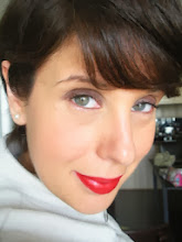
2) This photo is of my post recent post - this lipstick Mocha by MAC is a perfect TA shade and its actually the closest thing I've 'ever' come to a look that is 'My lips but better'. Bobbi Brown often says to find a lipstick that is only one or two shades darker than your natural lipcolour and Mocha 'literally' is that colour. Here is the rest of the makeup I used:
I used Loreal's W4 concealer and foundation, MAC's Gold Deposit powder and Gingerly blush. On my eyes, I started with NARS silent night, added #54 shadow from the lid into the crease and then lined my eyes with MAC's Teddy eyeliner and blended NARS Bengali shadow into the upper lash-line. I used Loreals Voluminous Brown-black mascara. I then finished off the look with MAC's Mocha lipstick

3) I feel that this is my most harmonious evening look. I used a lot of gold/copper tones on my face, and once again, it picked up on the gold undertone of my skin and the amber flecks in my eyes - the result is eyes that 'pop' and gold tones that literally 'awaken' my skintone. The lipstick 'Chili' by MAC 'compliments' the gold/copper tones and in turn creates a harmony of colours. Is this look more dramatic? Yes, but it is still harmonious with my colouring? Absolutely and thats the key to the puzzle!!!
For this look I started with my basic face (W4 concealer by Loreal, HD Foundation #155) and then applied Gold Deposit all over my face. I then used FACES #134 blush (a deep russet shade) and decided to compliment the rest of the look with 'golds' on my eyes (I stated with NARS Silent Night as a base, used MAC's Woodwinked from the lid into the crease, Amber Lights on the lid and then blended Romp into the crease/outer corners. I lined my eyes with Teddy liner and then smudged NARS Galapagos into the upper lash liner before finishing with Brown-Black mascara). I decided to give my lips some warmth combined with a wow factor red, so I used by trusted Chili with Auburn lipliner (MAC).
As I mentioned, I know there was a lot of reading with this post, but I felt I really had to explain well my feelings about what harmony means to me in the world of makeup. Its one thing to be a makeup artist and have a ton of colours to work with, but when it comes to finding a look that works for you and you're on a budget, its good to know that you have 2 or 3 looks that you know will never fail you. I think every woman should invest in having her colours done, regardless of how old you are. I don't think having your colours done is an 80's thing - I think its one of the best tools you can have to help you find and discover your best self - to find the shades that bring you to life vs those that make you look sick and grumpy - In the end, its about YOU and what makes you happy. For me, discovering harmony within my colour palette, has made me very, very happy!!!
2 comments:
I know I said in another post that I didn't think you were TA, however, I do really like the middle picture of you with the Mocha lipstick. To me you are rather Soft looking there. Or could you lean towards the soft side of the TA palette? Love Bobbi Brown because it's hard to go wrong with a lipstick that is one to two shades deeper than what you already have.
Thanks for the feedback - I think because my best style is more of a 'soft classic' look, I tend to look the most natural in a soft makeup look, but mocha matches the TA swatch fan so very well - it would be too brown and warm for the Soft Summer palette. During my draping, the analyst compared the Soft Autumn colours to the True/Warm Autumn colours and the SA palette made me look a little washed out. There was a natural harmony that was evident with the TA drapes - stay tuned for my next post where I create a similar look and then drape myself with some of the warmest shades of my palette - the end result is quite harmonious!!!
Post a Comment