
THese shades are my best 'neutrals' - Chocolate brown and the ivory/cream shades are particularily flattering as clothes and accessories.

I find these colours of my TA palette to be very flattering against my skintone - these colours are the warm berries, eggplant and brownish reds of my palette. I think these would make great purse and scarf shades!

My favourite orange-red lipstick 'Chili' matche one of the swatches on the left hand side. I can see myself wearing the shades on the right hand side during the spring/summer months. I love that coral and I think it would be a great blush shade for the warmer months as well!!!
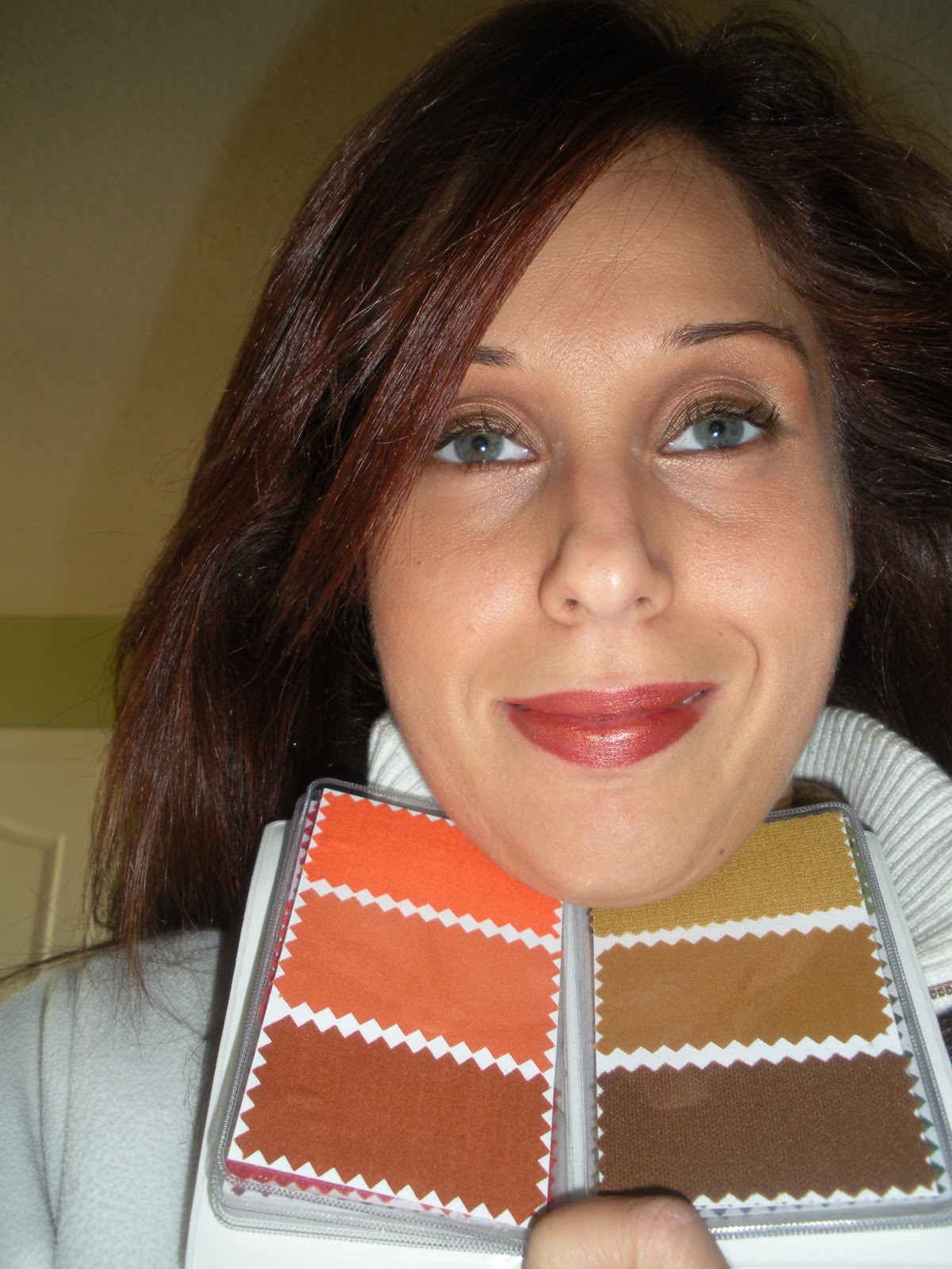
These are my favourite colours in the whole True Autumn Palette - I love the golden browns, golden-orange-browns, mustard and warm peach shades. I look for a lot of clothes in the colours of the right hand side of this palette - they are great as colours for sweaters and tops. I also have a scarf that is similar to the middle swatch on the right hand side and I wear it all the time! I feel these colours work very well against my skin-tone!!!

THe greens of my palette - I think these are the shades that I struggled with the most at first. I'm not really a green type of person, meaning green has never really been one of my favourite colours, but looking at this palette against my skin, I'm really liking how the moss and warm khaki greens work against my skin. Cool true greens have always made me look fake and un-natural, creating disharmony vs the harmony that I'm seeing here with the moss greens and khaki's. Its fun to see how all these colours are reacting with my skin and working together with the natural tones in my face, eyes and hair!!!

During my analysis, it was so obvious that the teal, warm blues were such a great fit for me in comparison to the cool toned blues (true and royal blue looked particularily unflattering on me). However, the teal blue just brought my face to life! I used to stay away from wearing a lot of blues because I thought my only options were light powder blue, sky blue and royal blues - all the cool toned blues. I never really liked this shades on me and now I know why - they drain the life right out of me. These swatches look amazing and I'm so happy to finally have a set of blues I really like.

Thesear darkest shades in my palette and are not my favourite. When I was drapped in the Deep Autumn colours just for comparison, the shades were similar to these and they were just too dark and not as becoming and elegant on me as the True Autumn shades. However, its great to know that I can use these colours as accessories like shoes, boots, purses, belts etc

Here I am holding the sci/art swatch fan for True Autumn - similar to the swatches of my draping and an indication that the True Autumn palette really is the best for me!
2 comments:
Thank you for posting this, Renata. Right now I'm trying to figure out whether I'm a Dark or True Autumn. You kind of make me hope that I'm a True!
Liz, one thing that I can tell you from my personal draping experience is that the DA shades are much deeper and darker than TA's - TA has a lot more of a golden/yellow undertone and need those spicy/yellow based colours. If you can handle the deeper shades (almost verging on black), you're probably DA, but if you need that rich, warm and golden base, TA is probably a better fit! Let me know if this has helped!
Post a Comment