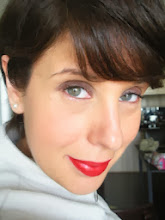

Here I am wearing a cool toned royal blue - the colour is clear and crisp and doesn't look bad, but is it my best??? Take a look at how my skin-tone automatically changes and comes alive in the warm blue (nothing has changed - same lighting, same makeup, same everything except that I changed the royal blue drape to a warm teal drape):

Did you notice how my eyes went from dull to vibrant - how my skin went from ashy pale to warm and peachy??? Its amazing how colour can impact the way your skin looks and how it appears. The warm blue actually makes my face appear more slender and youthful! Its just so amazing to me.
Here is a side by side view:
Now the question is what blue do you suit??? Are you a cool or warm toned gal??? Here are some colour inspirations to help you out:
If you're cool, look for these types of blues to add to your palette:

Cool tones women should look for inspiration from the sky, winter landscapes and the blue-gray shades of a dusky sky (especially if you're a soft summer).

Light and soft summers would look fantastic in the light powdery blues, while deep winters would really look spectacular is the deepest and darkest blue shades. Cool and clear winters glow in the more clear and cool royal blue shades.

What about us warm toned gals??, well, we rock our blues as well:

Our blues have added warmth to them, particularily added warm yellow shades, which is why sometimes our blues almost seem to have a greenish cast - when you mix blue and yellow what do you get??? However, look how awesome teal is as a dress colour and I think it works ever better as a skirt shade (check out how awesome the picture to the right is - you can harmonize so many wonderful warm shades with that warm teal skirt!)

The warm turqouise/teal shade on the right hand side of this palette would work so well with both a spring and autumn. It would work much better on an autumn if it were slightly more muted and look uber awesome on a spring with a hint more clarity, but this is a perfect example of a warm shade of turqouise-blue!

The great thing about warm shades of blue is that you can look for lighter and deeper shades of teal. Here is the perfect medium shade of teal. Take this shade a level or two lighter and darker and it would still fit into the warm palette, but all of a sudden you've given yourself colour options and degrees of tones to work with. Also, add some clarity and once again, you have the perfect warm robins egg blue for springs and muted it up a bit and you have autumn calling - its all good in the world of 'warmth'.
So, do warm toned gals have to say good-bye to blues??? Absolutely not - our blue may be different, but its still just as stunning and becoming! I would rather see my face look youthful and glowing in warm teal blue than sick and dead in a cool toned blue. Find YOUR best blue and work with your natural colouring!!!
13 comments:
Have you ever thought about becoming a colour analyst? I think you'd be good at it!
THanks Snezana - I would like to do something related to makeup and colour analysis one day. I would love to review makeup products for companies or magazines, even doing freelance work for them on the side. Its hard when you already have an established career to make a switch like that, but I just love makeup and colour so much - its a huge part of who I am!!!
Great illustration!! The difference is really visible on you.
Great post, Renata! I tend to prefer the lighter blues, like sky blue, and I miss them. I can't quite get into teal. Yet. You never know. But it's good that you have clarified the different blues and who should wear what.
this post is Eye Candy! Just gorgeous examples help us *see* the explanation. Thank you!
I don't think it's teal blue...it's a dusty blue...
Renata, the first of all, I would like to thank you for all your posts. They all are very interesting and helpful. I liked the palette for eyes with the warm turqouise/teal shade. What is the name of this palette?
Hi Margo,
Thanks! I don't know the exact name/company of the palette - I did a google search for warm blue and this photo came up - although if you check out sephora, you may find it or at least something very similar - sorry I could be more help!
Thank you, Renata! It would be very interesting to know about your favourite make-up products not only lipsticks in a different post.
Thanks for the tip Margo - thats very helpful - I love getting feedback - its important for me to know what people are interested in and what they'd like to see me do in the future!!!
I actually think you look better in the royal blue . The first pic. Your hair looks shinier as opposed to almost ashy and dull in the second.
The royal blue color looks stunning on you and in the second photo you look tired and drawn in comparison. There are shadows around your face, i.e. mouth and eyes with the warm colors and you look a bit drained, whereas in the royal blue it clears your face completely and I agree with the post above, that it also brings out the color in your hair. In the very first Color Me Beautiful book it even shows a Winter with hair similar to yours that has lots of reddish highlights (auburn) but it is a COOL auburn. Have you ever considered the Winter category? There are several categories to the Winter category now, too. Thank you for sharing your artistitic talents, I am thrilled to have found your blog! There is so much great information here.
THanks for writing - I think the makeup might have been throwing off the warm/cool shades - I have recently been draped as a 'WARM AUTUMN' - I bet with different makeup, it would have changed the effect of the royal blue vs teal. WHen I was draped in person, the cool blues made me look 'ashy' - but the teals were 'awesome'!
Post a Comment